As restaurants sought to enhance their customer experience, they turned to vintage Coca-Cola menu boards to capture the essence of this iconic brand. The 1970s were a golden age for American diners. Stainless steel counters, jukeboxes humming Fleetwood Mac, and families gathering around orange vinyl booths defined an era. But a quiet revolution was happening on the walls of these establishments, led by Coca-Cola. Enter the Marketeer Menu Boards, Coca-Cola’s mid-1970s innovation that promised versatility, style, and increased sales for restaurants of all sizes and transformed diner menus forever.
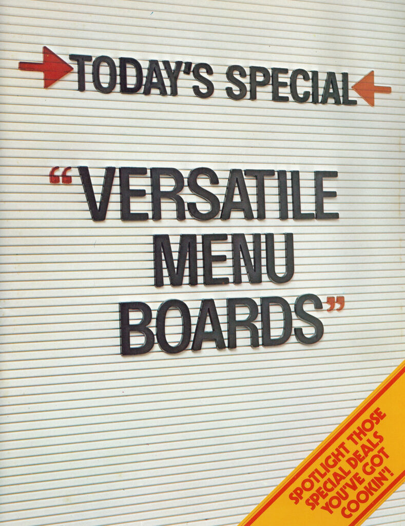
Today’s Special: Versatile Menu Boards
Coca-Cola’s trade catalog from the era proudly declared:
“Today’s Special: Versatile Menu Boards”
These were more than just static signs. Designed with interchangeable panels and crisp typography, they allowed restaurateurs to update menus daily, without needing a new board.
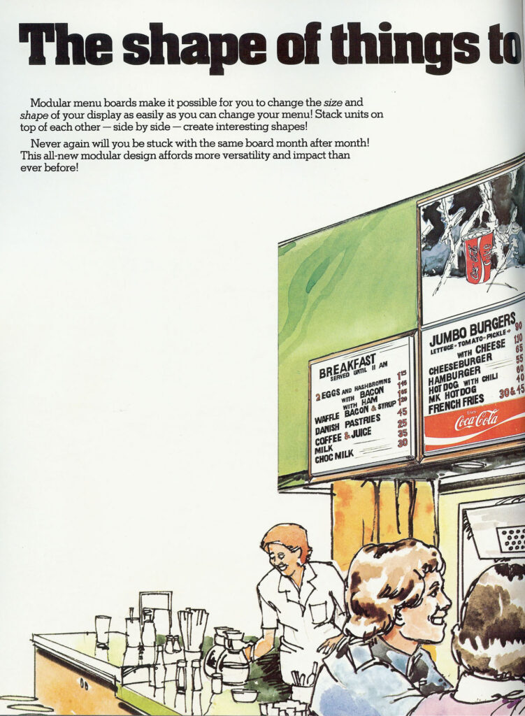
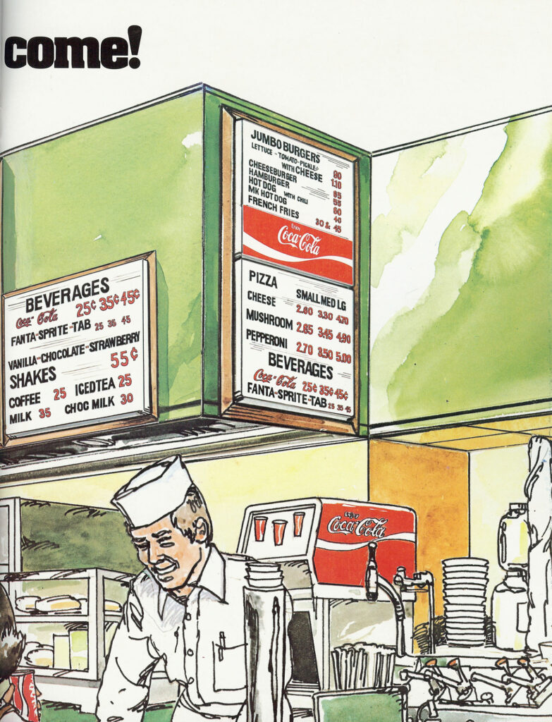
The Shape of Things to Come
Illustrations in the catalog showed families enjoying burgers and fries under gleaming white menu boards with prices like:
- Jumbo Burger – 90¢
- Cheeseburger – $1.10
- French Fries – 30¢
The Coca-Cola logo, in its bold red script, anchored every board, linking quality beverages to hearty meals.
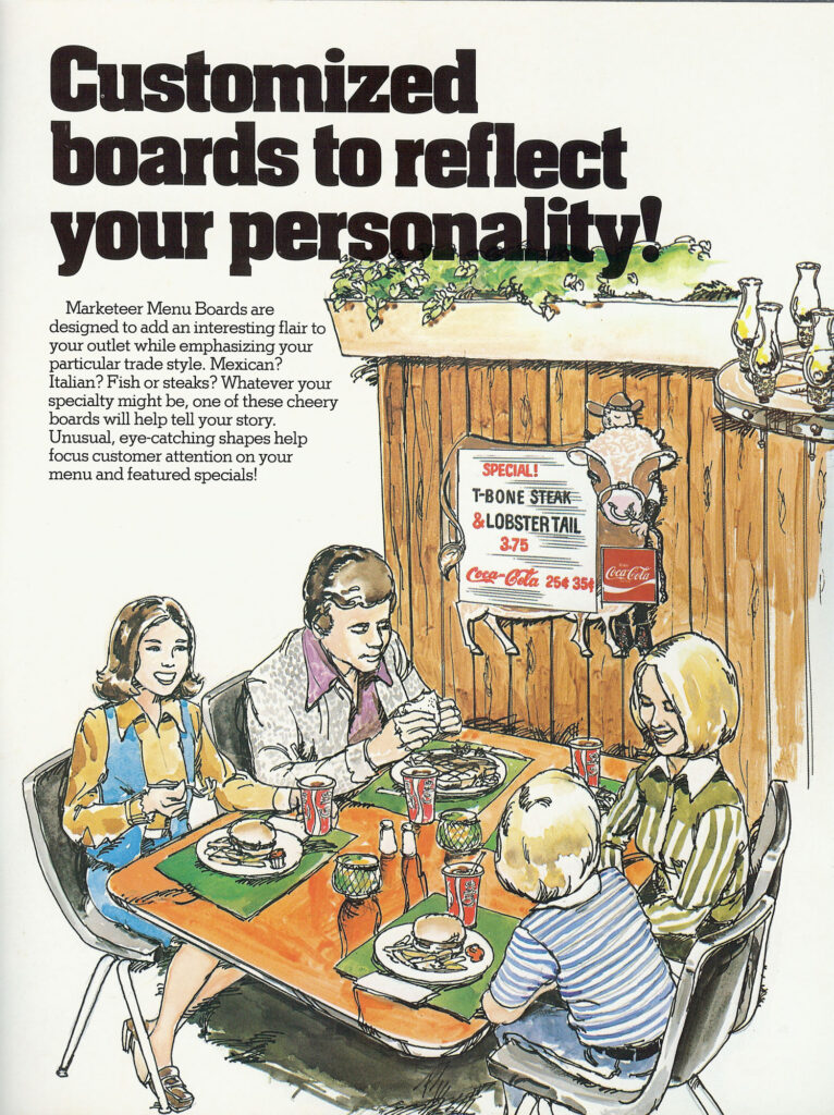
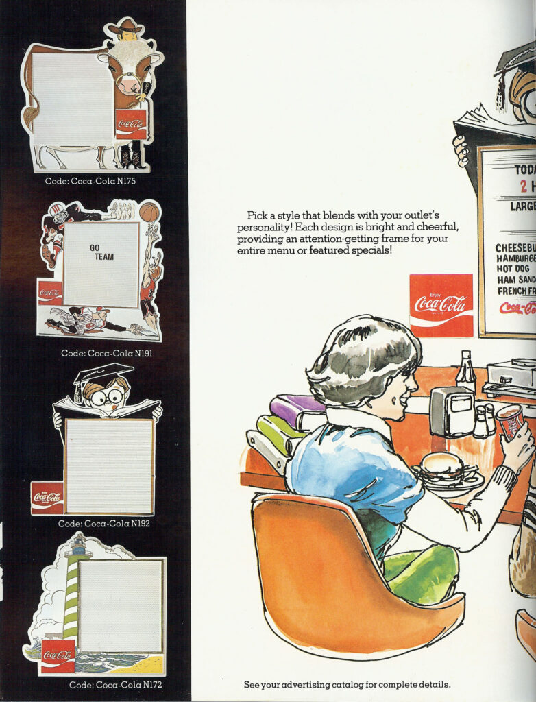
Customized Boards to Reflect Personality
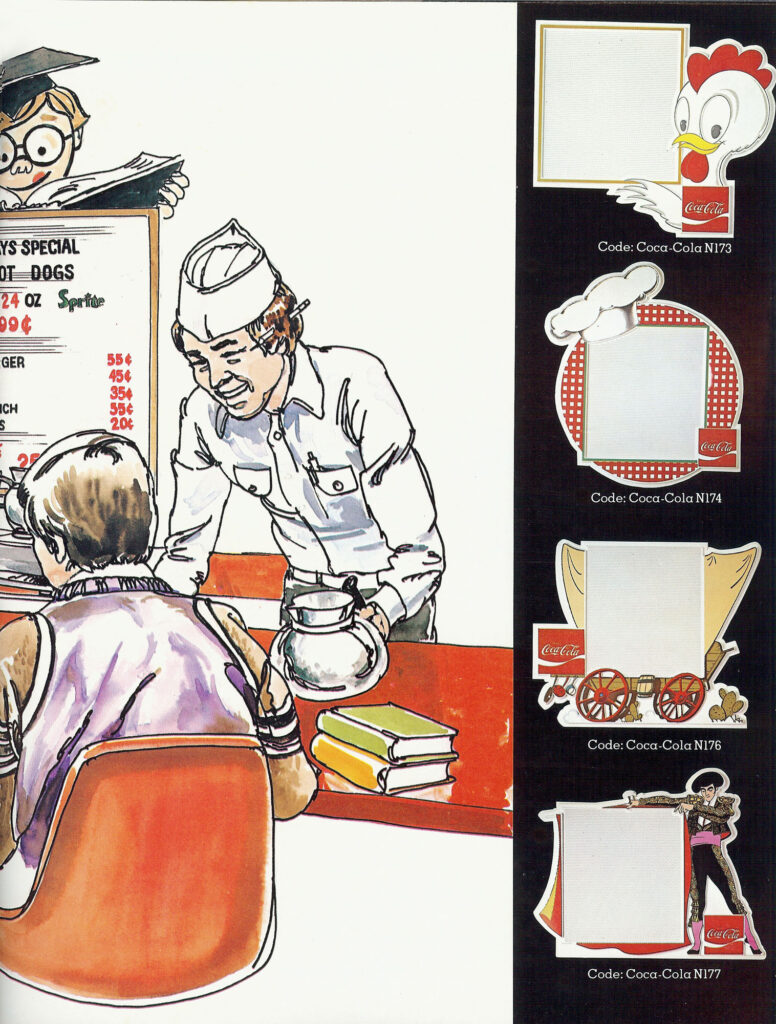
Themed frames gave eateries personality:
- 🐮 Cow-shaped boards for steakhouses
- 🏖️ Lighthouse motifs for coastal diners
- 🎓 Graduation caps for college cafés
- 🤠 Covered wagons for western BBQ joints
These designs weren’t just functional, they were marketing tools.
Quick Promotions, Big Returns
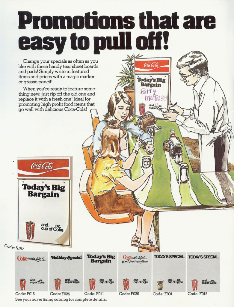
With tear-sheet boards and grease-pencil inserts, specials could be written and erased daily. A few of the combos featured:
- 🍗 Fried Chicken & Coke
- 🌮 Tacos & Coke
- 🍔 Patty Melt & Coke
Coca-Cola wasn’t just selling soda; they were selling higher margins and a branded experience.
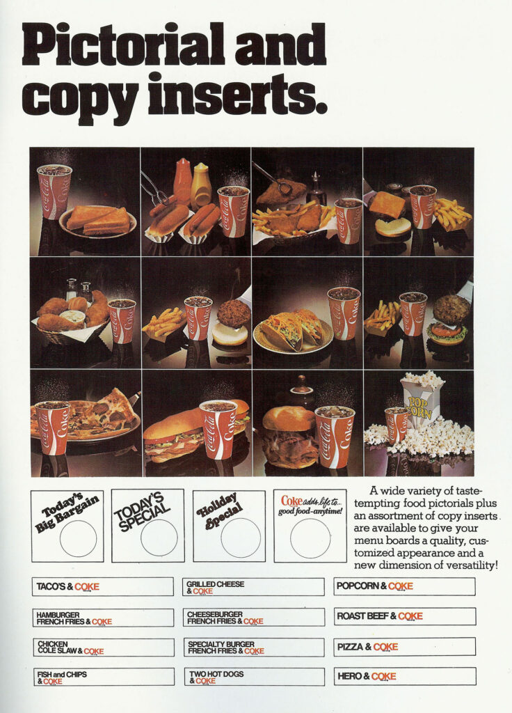
Pictorial Inserts: Selling the Meal With the Drink
High-quality photo inserts showed:
- Golden fried chicken next to an ice-cold Coke.
- Pepperoni pizza paired with Coca-Cola.
- Burgers, fries, and paper Coke cups under bright diner lights.
These inserts helped even small diners look as professional as rising fast-food chains.
A Cultural Snapshot: Diners and Drive-Ins in the 1970s
Molded chairs, chrome soda fountains, paper hats, these visuals captured more than menus. They documented an era of community, affordability, and Americana, where a family meal out cost under $5.
Why the Mid-to-Late 1970s?
“Coke adds life” slogan debuted in 1976.
- TAB and Fanta branding mirror Coca-Cola’s 70s product lineup.
- Prices match pre-inflation dining costs.
- Soft watercolor illustrations echo 1970s advertising styles.
By 1982, digital menus and Diet Coke would usher in a new era. But in these pages, Coca-Cola reigned supreme.
Legacy of the Marketeer Menu Boards
Today, surviving examples of these boards are rare collectibles. Yet their influence lives on in digital menu systems and co-branded promotions worldwide.
Final Reflection: Today’s Special Forever
The Marketeer Menu Boards remind us of an age where even the simplest diner could feel modern, professional, and enticing, thanks to Coca-Cola.
“Today’s Special isn’t just on the plate, it’s on the wall, sparking cravings and sealing the deal with a Coca-Cola.”
Learn More About the Company Brand Featured in this Promotion
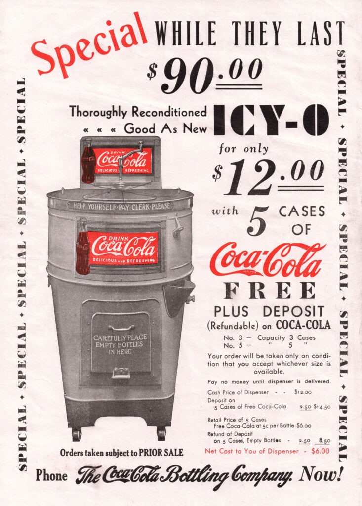
This 1920s Coca-Cola advertisement for the ICY-O dispenser, with its bold promise of a reconditioned unit “Good As New” for $90.00, is more than a simple sales pitch. It is a window into an America on the brink of transformation, a nation defined by Prohibition, technological leaps, and a cultural obsession with speed and convenience. This ad not only marketed a product but also reflected the sweeping societal changes of the Jazz Age.
The eye-catching headline “Special While They Last”, flanked by repeated “SPECIAL” markers, speaks volumes about the urgency Coca-Cola instilled in their marketing. But beyond these bold claims lies a deeper narrative about how Coca-Cola, the bottled drink that began in soda fountains, expanded its empire by making refreshment instantly available, everywhere.
A Barrel of Cool Refreshment
In the early 1920s, the ICY-O dispenser symbolized modernity. Shaped like a metallic barrel and designed to keep bottled Coca-Cola icy cold, it was utilitarian and unpretentious. On the surface, it invited customers to engage with it directly: “Help Yourself – Pay Clerk Please.” For store owners, it meant tapping into a cultural shift toward immediacy and autonomy.
The dispenser’s appeal was clear. With its internal ice compartment and capacity to hold three to five cases of Coca-Cola, it brought the soda fountain experience to any retail setting, from corner groceries to train stations. Its promise of refreshment was simple, efficient, and above all, self-serve.
At $90.00, a substantial sum at the time., the dispenser came with five free cases of Coca-Cola, turning the purchase into a long-term investment for merchants eager to meet growing demand.
The 1920s and Coca-Cola’s Golden Opportunity
The 1920s was an era defined by contradictions: while the U.S. government banned alcohol through Prohibition (1920-1933), Americans developed an insatiable appetite for other forms of refreshment. Soft drinks like Coca-Cola surged in popularity as they filled the void left by shuttered saloons.
The Prohibition Effect
During Prohibition, soda fountains and bottlers seized their chance. Bars converted into “soda shops,” and Coca-Cola’s bottling plants increased exponentially. By 1929, the company boasted more than 1,000 bottling plants, reflecting their aggressive push to make Coke available anywhere.
The ICY-O catered perfectly to this landscape. It offered storekeepers a means to capitalize on the beverage’s popularity without installing a full soda fountain, which required counter space and staff.
Urbanization and Changing Lifestyles
As millions flocked to cities, the demand for convenient, affordable refreshments grew. The rise of the automobile also made roadside commerce viable, and cold bottled Coca-Cola became the drink of choice for travelers needing a quick stop.
A Shift Toward Self-Service
The ICY-O reflects a broader cultural pivot toward self-service retailing. While today it feels second nature to grab a bottle from a cooler, in the 1920s, this was a novel concept. Coca-Cola was teaching America to trust itself in this new consumer landscape.
The ICY-O Company of Charlotte, North Carolina: A Crucial Partner
While Coca-Cola was busy expanding its bottling empire, the dispensers themselves were produced by The ICY-O Company of Charlotte, North Carolina. Founded in the early 20th century, ICY-O specialized in innovative refrigeration solutions designed to hold ice and keep bottled beverages cold for hours.
ICY-O became a natural collaborator for the soft drink giant. Their dispensers were rugged and functional, using insulated metal barrels that merchants could refill with ice daily. These devices became a fixture in general stores, train depots, and filling stations across the South and eventually nationwide.
The partnership illustrates Coca-Cola’s genius for collaboration with local manufacturers. Instead of designing and producing dispensers in-house, Coca-Cola worked with ICY-O to distribute thousands of these machines, effectively embedding Coca-Cola branding into ICY-O’s very product design. The result was a mutually beneficial relationship: ICY-O enjoyed steady business supplying dispensers, while Coca-Cola expanded its reach with minimal overhead.
The ICY-O Company itself contributed to the early refrigeration revolution in America, helping to transition businesses from block ice chests to insulated, self-contained units.
Functional Elegance with Urgent Messaging
The ad’s design is straightforward but effective. Oversized fonts scream “$90.00”, “$12.00”, and “FREE”, while Coca-Cola’s red script logo provides instant brand recognition. The repeated “SPECIAL” down both margins functions almost like a neon sign, an attention-grabbing tactic for busy shopkeepers flipping through trade journals.
Unlike later mid-century Coca-Cola ads that leaned into lifestyle imagery, this ad is strictly business. It’s a utilitarian pitch aimed squarely at merchants, highlighting practical details like the refundable deposit and machine capacity.
Why This Ad? Why This Moment?
Coca-Cola’s approach with the ICY-O demonstrates their keen understanding of the era’s retail challenges. Instead of relying solely on soda fountains, then the primary venue for soft drink sales—they equipped merchants to meet consumers where they were. This strategy expanded their footprint and reduced dependence on counter service.
It also points to Coca-Cola’s early mastery of vertical integration. By controlling the bottling, distribution, and retail equipment (with help from companies like ICY-O), Coca-Cola ensured that a cold Coke was never out of reach.
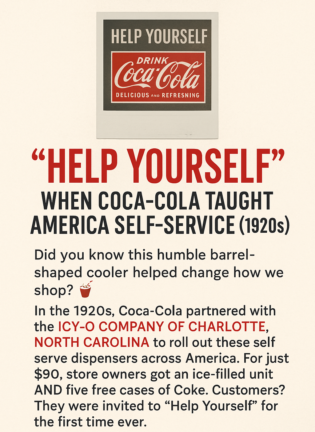
The ICY-O wasn’t just a dispenser; it was part of Coca-Cola’s broader effort to modernize refreshment and drive bottling sales. It combined the allure of chilled soda with the practicality of self-service, offering store owners a chance to engage a customer base that increasingly prized speed and convenience.
This ad reflects a pivotal moment when Coca-Cola transitioned from a pharmacy fountain drink to a bottled icon of mass consumption.
ICY-O’s Legacy
The ICY-O Company faded from prominence as refrigeration technology evolved, but its influence remains. These early dispensers taught Americans the ritual of reaching into a cooler for a cold drink, a behavior that Coca-Cola leveraged into dominance throughout the 20th century. By democratizing access to cold soda, ICY-O dispensers transformed corner stores and roadside stands into vital nodes in Coca-Cola’s distribution web. This collaboration helped solidify Coca-Cola’s reputation as the drink of choice for a nation on the move.

Legacy Takeaway
Nearly a century later, the ICY-O seems quaint, yet it symbolizes Coca-Cola’s foresight and ICY-O’s role in refrigeration history. This ad wasn’t just selling a machine, it was selling a future where refreshment was instant and ubiquitous.
For Coca-Cola, the strategy worked. By 1929, despite the looming Great Depression, the brand’s reach was unrivaled. The ICY-O had done its part, proving that with the right tools and a little ice, even the smallest shop could become a Coca-Cola outlet. The ad’s simple message, “Help Yourself” was prophetic. It anticipated an America that would come to embrace convenience and autonomy as hallmarks of modern consumer culture.
Learn More About the Company Brand Featured in this Promotion
Discover the history of Coca-Cola’s iconic 2-liter Bonus Bottle campaign from the late 1970s. Learn how this bold marketing strategy changed beverage packaging forever and explore the point-of-sale (POS) materials that brought it to life in grocery stores across America. As part of this campaign, the Coca-Cola 2 liter bottle became a symbol of consumer value.
The Spark of Innovation
The introduction of the Coca-Cola 2 liter bottle marked a significant shift in beverage packaging.
In 1979, America was in transition. The vibrant optimism of the early 1970s had given way to economic challenges, energy crises, and shifting consumer priorities. Amidst these changes, Coca-Cola prepared to launch one of its most ambitious innovations yet: the 2-liter glass Bonus Bottle.
Shoppers quickly recognized the benefits of the Coca-Cola 2 liter bottle for family gatherings.It offered a practical solution for families, making the coca-cola 2 liter bottle a staple in homes.

It became synonymous with festive gatherings, where the Coca-Cola 2 liter bottle was often the drink of choice.
By the late 1970s, Coca-Cola had been a household name for nearly a century, but the beverage industry was evolving. Competitors like Pepsi were advancing with campaigns such as the “Pepsi Generation,” while private-label sodas chipped away at Coca-Cola’s market share with aggressive pricing.
The coca-cola 2 liter bottle quickly became a favorite for parties and events.
People loved the Coca-Cola 2 liter bottle for its affordability and convenience.
Consumers were also seeking more convenience and value, larger packages for family use, bulk savings, and products designed for a home-centered lifestyle. Coca-Cola needed a marketing strategy that could address these needs and cement its position as the market leader.
The solution was the 2-liter glass bottle, unprecedented in size for soft drinks. Heavy and substantial, it offered 5% more soda than the popular 64-ounce size for the same price, appealing to value-conscious shoppers.
The Marketing Campaign
The Coca-Cola 2 Liter Bottle: A Game Changer in Beverage Packaging
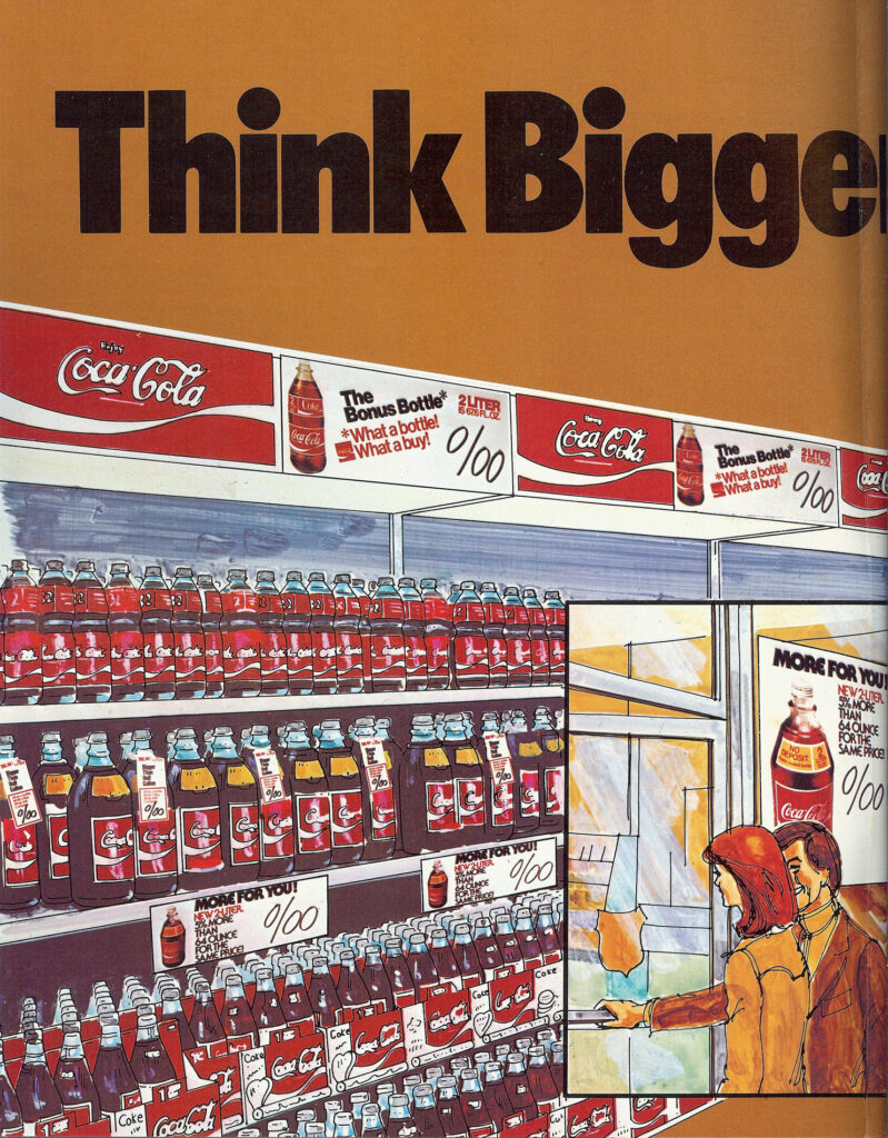
To introduce the Bonus Bottle, Coca-Cola launched a bold point-of-sale (POS) marketing campaign under the slogan “Think Bigger.”
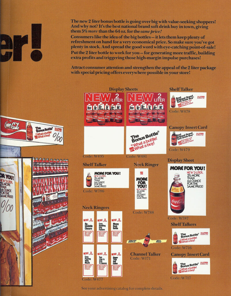
This was not just an advertising effort aimed at consumers; it was a comprehensive merchandising strategy for retailers. Coca-Cola provided an array of promotional materials to transform store displays into attention-grabbing marketing zones:
- Shelf Talkers – Eye-catching signs for grocery shelves.
- Neck Ringers – Promotional tags placed around bottle necks.
- Canopy Insert Cards – Visuals for coolers and aisles.
- Display Sheets – Posters and banners encouraging multi-bottle purchases.
Each item carried catalog codes like W478 (shelf talker), W479 (canopy insert), and W786 (the iconic “MORE FOR YOU!” signage).
Today, the Coca-Cola 2 liter bottle remains a nostalgic reminder of the past.
The messaging was designed to resonate with shoppers:
“The Bonus Bottle. What a bottle! What a buy!”
“More for you! New 2 Liter—5% more than 64 oz. for the same price!”
Supermarkets across North America were encouraged to create bold, high-visibility displays of 2-liter glass Coca-Cola bottles, ensuring the Bonus Bottle was impossible to overlook.
The Grocery Store Revolution
As the campaign rolled out, the 2-liter Coca-Cola bottles began appearing in aisles from coast to coast. They were stacked under large “Think Bigger” banners, creating a striking visual presence.
The bottles themselves were distinctive. Made of thick, returnable glass, each one featured an embossed message around its neck: “RETURN FOR DEPOSIT.” The substantial weight and cool surface gave the impression of quality and abundance.
This packaging wasn’t merely functional; it became a symbol of value and family togetherness during a period of rising grocery bills and cultural shifts toward bulk purchasing.
The POS advertising materials reinforced Coca-Cola’s branding at every shopper touch point, from store entrances to checkout lanes.
Cultural Shifts in Beverage Marketing
The appeal of the Coca-Cola 2 liter bottle transcended generations, remaining popular among new consumers.
As trends shifted, the Coca-Cola 2 liter bottle still held its ground as a consumer favorite.
It continues to represent value in the beverage market, the Coca-Cola 2 liter bottle is still recognized for its size and affordability.
The Bonus Bottle campaign wasn’t just a marketing triumph; it reflected broader changes in American consumer habits. The preference for larger sizes paralleled trends in other consumer goods as families sought to stretch budgets and reduce shopping frequency.
However, while the 2-liter glass bottle succeeded in creating impact, it also revealed challenges. Its weight and fragility complicated transportation and storage. By 1982–1983, Coca-Cola and competitors began transitioning to lighter, unbreakable PET plastic bottles, signaling another packaging revolution.
Despite its relatively short lifespan, the glass 2-liter left a strong impression. Its hefty, the sound of glass clinking in shopping carts, and the ritual of twisting open its cap became part of household memories.
The Legacy of Coca-Cola’s “Think Bigger” Campaign
Ultimately, the Coca-Cola 2 liter bottle has left an indelible mark on beverage history.
As we reflect on its legacy, the Coca-Cola 2 liter bottle will always be part of our collective memories.
Today, the “Think Bigger” campaign is remembered as a pivotal moment in Coca-Cola’s history. It showcased the company’s ability to innovate both in product packaging and retail merchandising.
Collectors prize original POS materials from the campaign, shelf talkers, neck ringers, and banners, as artifacts of a bygone era. These items reflect the design language of the late 1970s, with bold sans-serif fonts, warm earthy colors, and hand-drawn illustrations of bustling grocery aisles.
The Bonus Bottle also represents a time when glass dominated the beverage industry, just before plastic transformed into how the world consumed soft drinks.
A Snapshot in Coca-Cola History
The 2-liter Bonus Bottle and its accompanying POS marketing materials stand as snapshots of a cultural and commercial moment. They represent not just a new package size but a strategic response to a changing world.
In retrospect, the campaign’s success lies in its simplicity and boldness, proof that even a century-old brand could “Think Bigger” and redefine its place in the market.
Learn More About the Company Brand Featured in this Promotion
In August of 1959, the Outdoor Advertising Incorporated (OAI) company released its latest promotion for the Fall of 1959. This promotion aimed to promote Coca-Cola through outdoor advertising and billboards featuring the iconic 1959 Coke Billboards.
The promotion was called Star Performers Build Sales for You. It highlighted that in the Fall of 1959, the bright lights of the entertainment industry and outdoor advertising would team up as the McGuire Sisters to sell Coca-Cola to America.
By blending the 3 McGuire Sisters singers with the selling power of outdoor advertising, the Coca-Cola Company aimed to create a powerful combination for their outdoor posters.
Posters that Build Sales of Coca-Cola
The 1959 Coke Billboards became a symbol of the advertising strategies employed by Coca-Cola to capture the attention of consumers and create lasting impressions.
The promotion was targeted at Coca-Cola bottlers. An introduction to the promotion detailed the history of Coca-Cola using outdoor poster advertising.
Because their audience grows automatically with population increases, 24-sheet posters are uniquely inexpensive compared to other media.
In 1925, The Coca-Cola Company first offered Bottlers of Coca-Cola a chance to participate in an advertising medium. This medium consisted of 24-sheet posters, with total expenditure amounting to $453,886.76. This offer has never been withdrawn, and spending grew to $3,372,412.19 by 1958.
This history represents the most consistent use of any advertising medium, with expenses shared between The Coca-Cola Company and the Bottlers of Coca-Cola.
There must be some kind of reason for such consistency, and there was. Posters have proven to be unique in several respects and have successfully served Coca-Cola.
For instance, they are the only medium that allows advertisers to capture consumer attention while they move from inside their homes to the point-of-sale.
Their size gives advertisers like The Coca-Cola Company a highly desirable dominance and prestige. Their distribution allows the message to stay with consumers while they move about outdoors.
Additionally, their use of full-color printing presents the product in a realistic and appetizing manner.
The Outdoor Advertising Incorporated company felt that the decade of the fabulous 1960s would see disposable income growing by leaps and bounds and advertising’s responsibility to secure a fair share for Coca-Cola becoming increasingly heavy. Under such circumstances, they felt that any advertiser would find themselves particularly obligated to look at the poster medium as not only one of the most effective media but, in all probability, the most economical one for doing this kind of job.
The Outdoor Advertising Incorporated company anticipated that the fabulous 1960s would see disposable income growing significantly. They believed advertising’s responsibility to secure a fair share for Coca-Cola would become increasingly critical.
Under such circumstances, they felt any advertiser would find themselves particularly obligated to consider the poster medium as one of the most effective and economical options for this task.
All Year Long Around the Clock Star Performers Sell for You
To encourage Coca-Cola bottlers to purchase the outdoor billboards in this promotion, the Outdoor Advertising Incorporated company used taglines like:
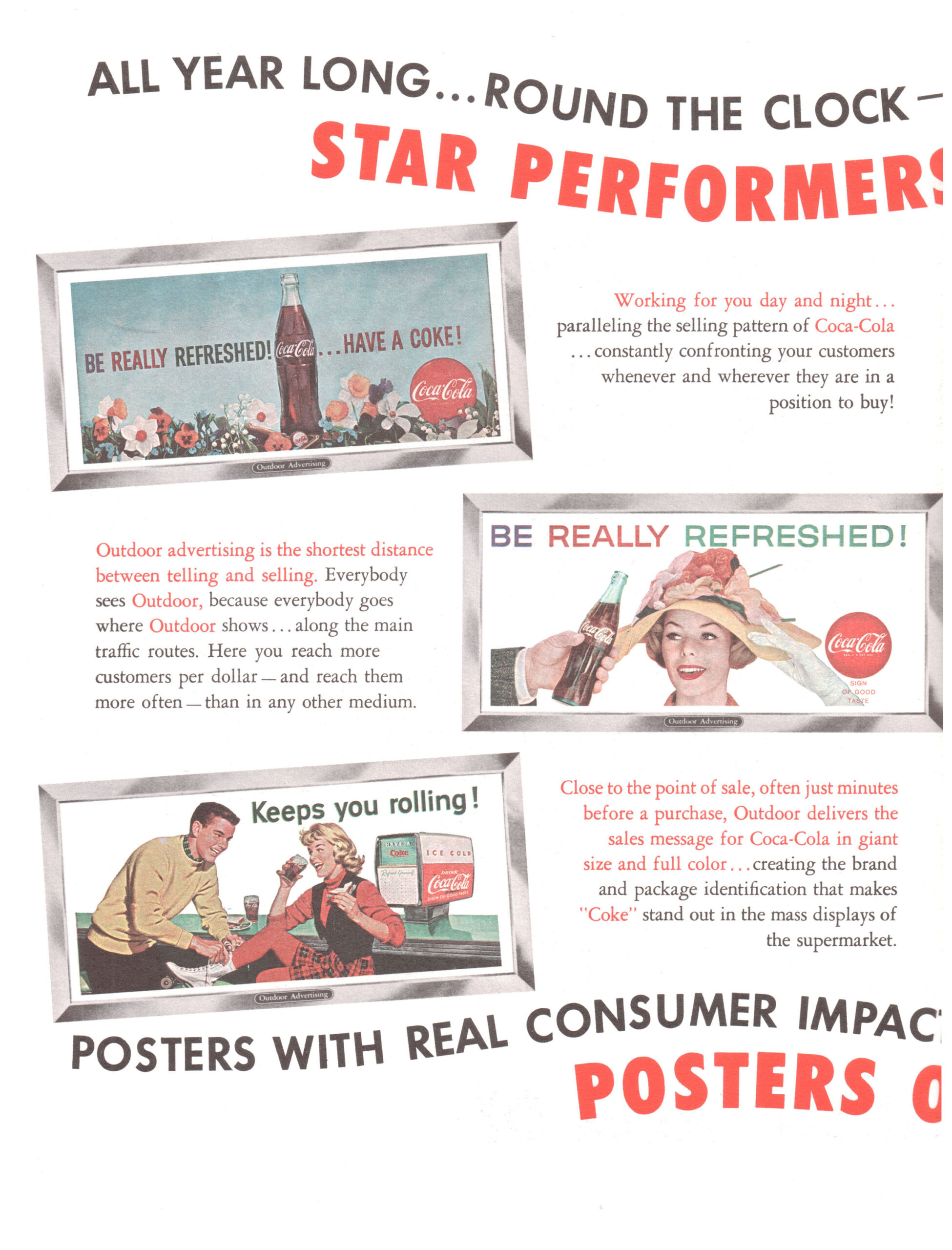
- “Working for you day and night”
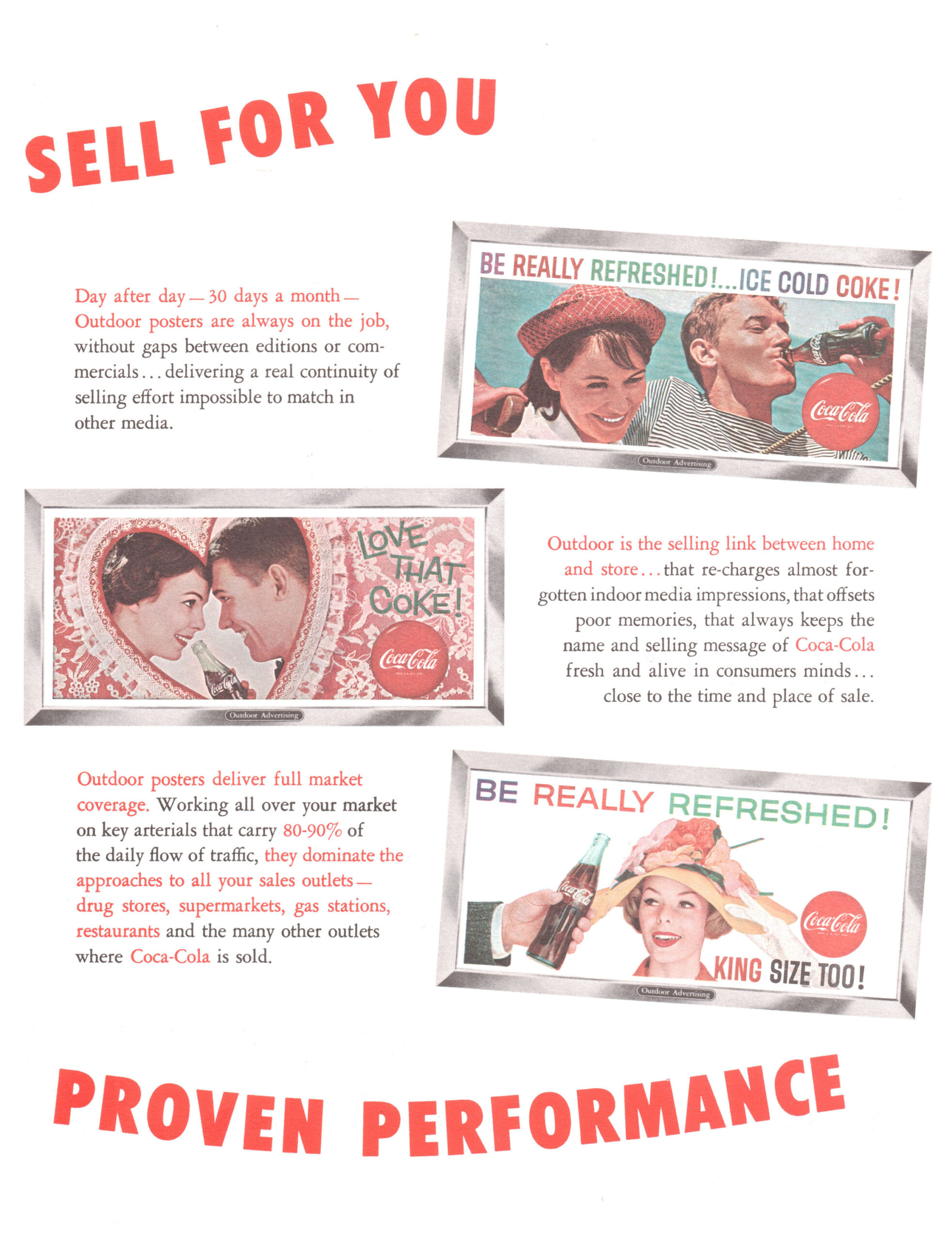
- “Day after day, 30 days a month, outdoor posters are always on the job”
- “Outdoor advertising is the selling link between home and store”
Within these taglines, they showcased six new outdoor billboards.
Outdoor Posters Create Top Level Readership
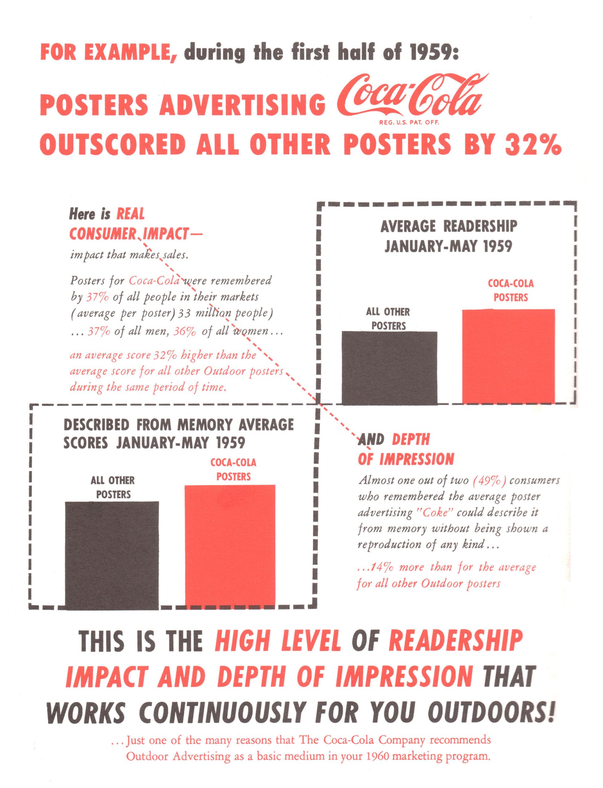
To further support why Coca-Cola bottlers should purchase the billboards in the “Star Performers Build Sales for You” promotion, information on outdoor readership was provided. This information demonstrated the benefits of outdoor performance.
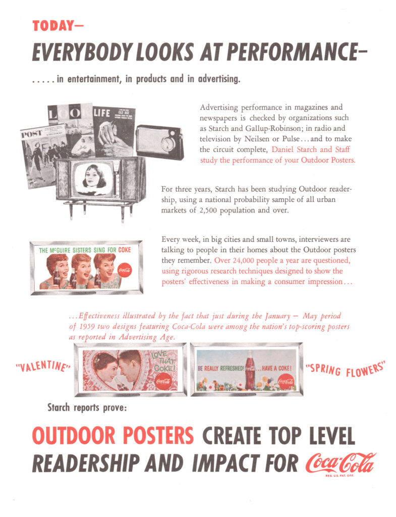
Posters Advertising Coca-Cola Outscored Other Posters by 32% in First Half of 1959
To further support why Coca-Cola bottlers should purchase the billboards in the promotion, information regarding readership impact and depth of impression was presented.
Posters with Real Consumer Impact – The 1959 Line Up
The following outdoor poster billboards were used in this promotion:
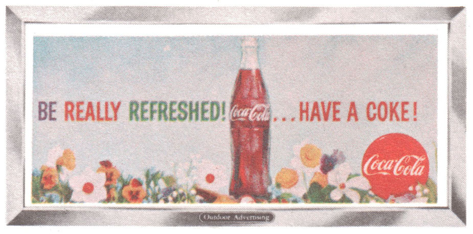
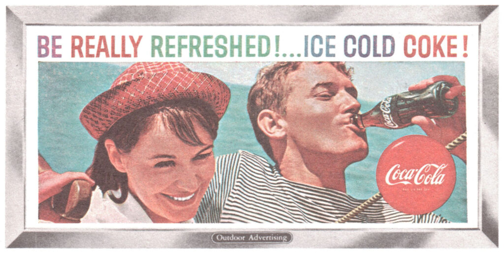
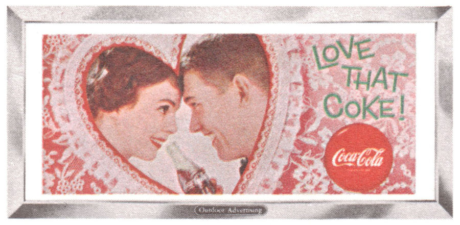
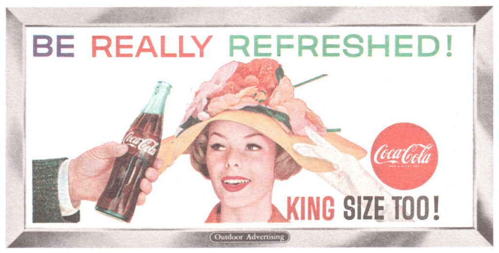
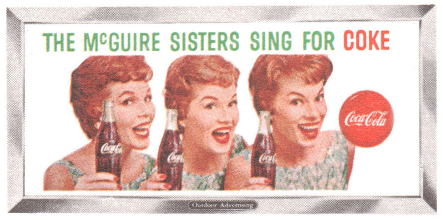
- The Be Really Refreshed Have a Coke outdoor advertising billboard featured a bottle of Coca-Cola sitting in a field of flowers with a trademark Coca-Cola disc in the lower right corner.
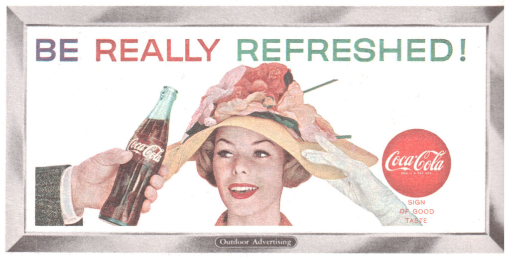
- The Be Really Refreshed outdoor advertising billboard featured a woman with a brown and pink hat being handed a regular size bottle of Coca-Cola with a trademark Coca-Cola disc in the lower right corner.
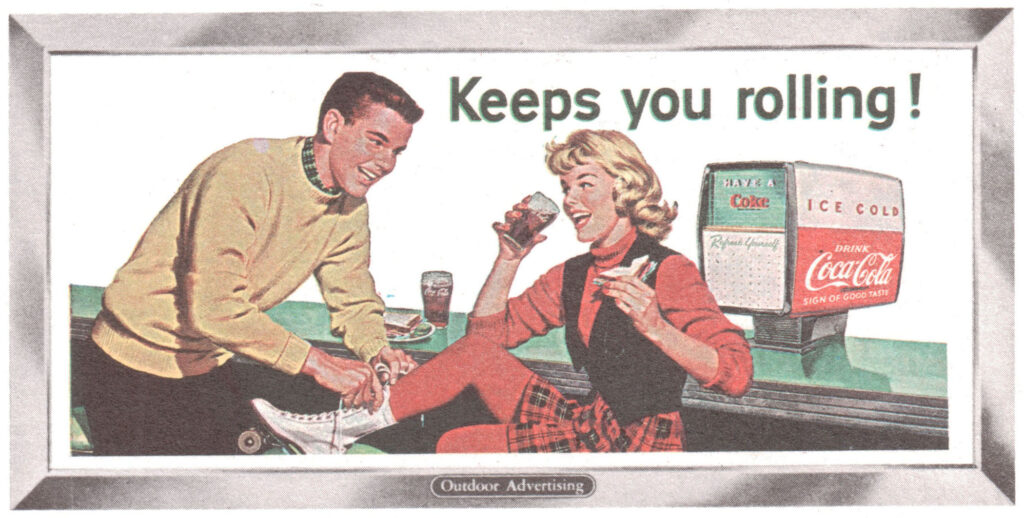
- The Keeps you Rolling outdoor advertising billboard featured a man and woman at an ice skating rink drinking glasses of Coca-Cola next to a fountain dispenser.
- The Be Really Refreshed Ice Cold Coke outdoor advertising billboard featured a man and woman on a boat with a trademark Coca-Cola disc in the lower right corner.
- The Love that Coke outdoor advertising billboard featured a man and woman drinking a bottle of Coca-Cola over a heart-shaped background with a trademark Coca-Cola disc in the lower right corner.
- The Be Really Refreshed King Size Too outdoor advertising billboard featured a the same woman with a brown and pink hat being handed a King size bottle of Coca-Cola with a trademark Coca-Cola disc in the lower right corner.
- The McGuire Sisters Sing for Coke outdoor advertising billboard featured the McGuire sisters singing group each holding a bottle of Coca-Cola with a trademark Coca-Cola disc to their right.
